Healthcare · Design-led
Relode
One design system for every healthcare hiring workflow.
Relode connects healthcare employers, candidates and the people who refer them. We brought its growing products into one design system, with shared typography, icons, colors, components and page layouts.
- UI/UX
- Product Design
- Iconography
One platform, several ways to use it
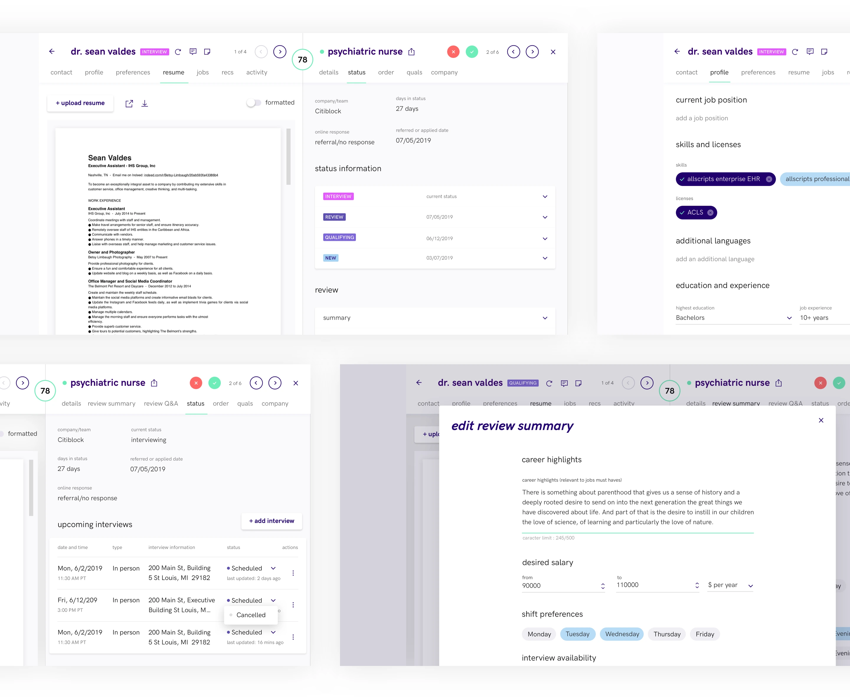
A candidate applying for a job, a colleague making a referral and an employer reviewing applicants need different tools. Relode’s products needed a shared visual language that could support all three workflows.
Our work began with an experience audit and continued through the foundations, reusable components and page patterns of a unified design system.
Start with the friction
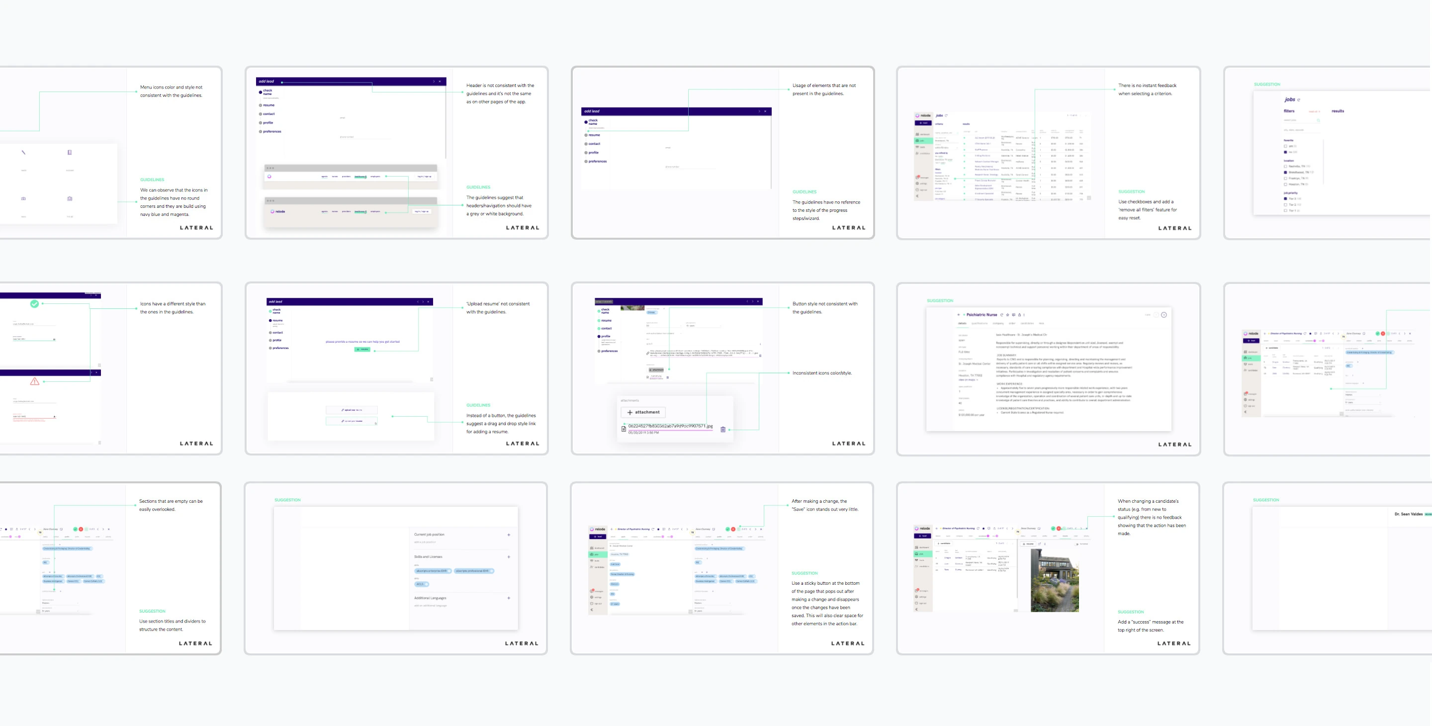
We reviewed navigation, typography and interface behavior across the existing pages. The audit documented inconsistencies and places where users could lose their way, giving the design work a concrete starting point.
A shared visual language
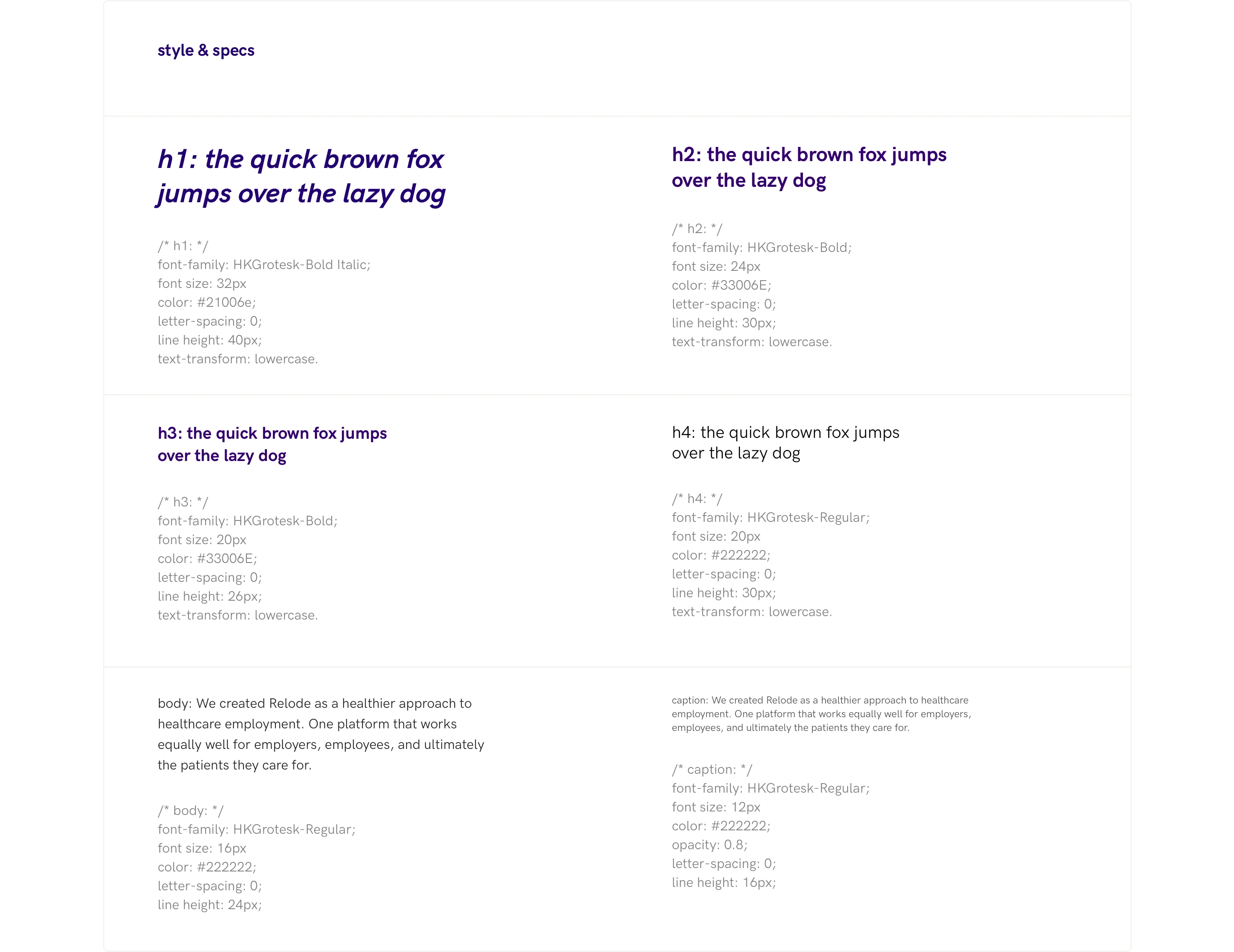
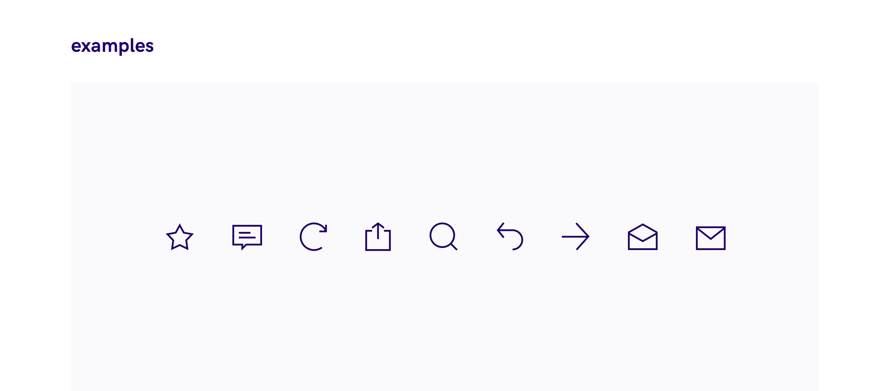
We defined type styles, line heights and spacing to establish a clear reading hierarchy. A consistent icon family gave common actions the same visual treatment across the product.
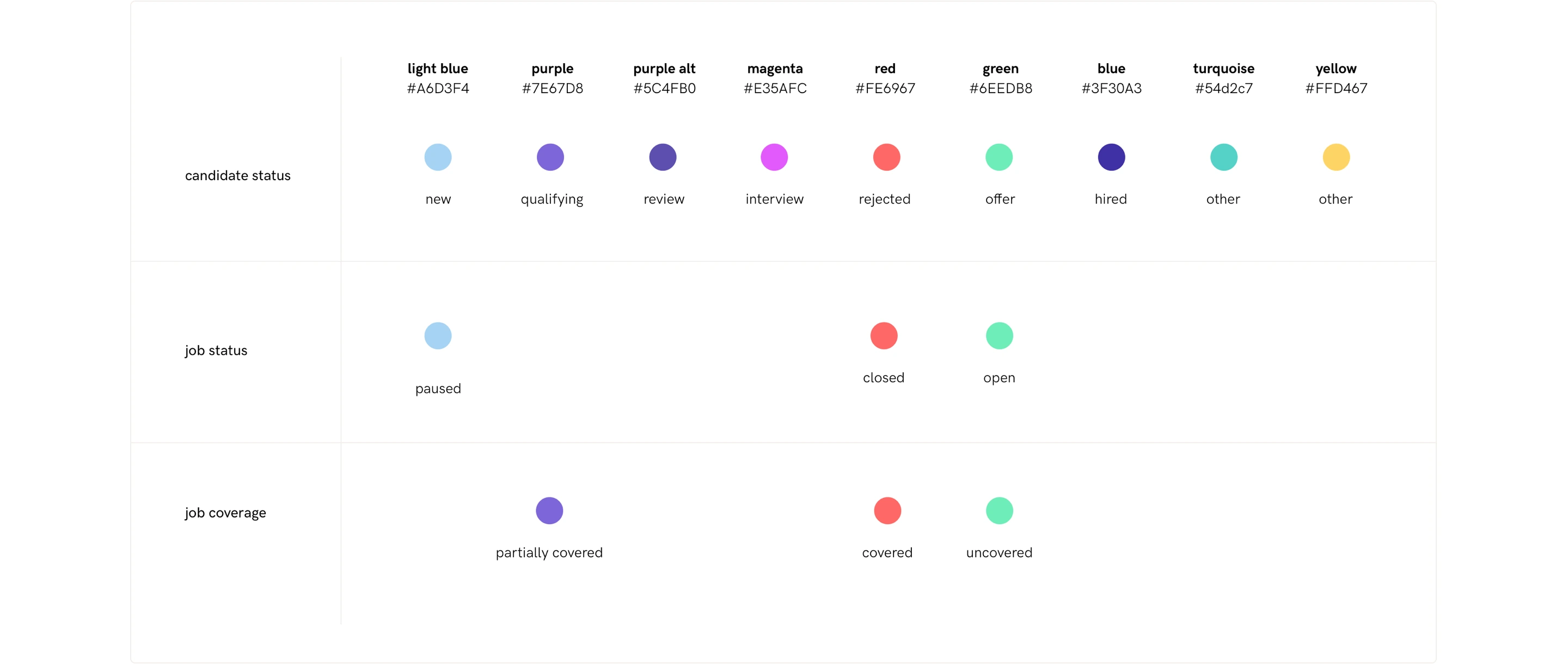
Color rules distinguished candidate stages, job statuses and task progress. These states paired color with labels so their meaning did not depend on color alone.
Components that work together
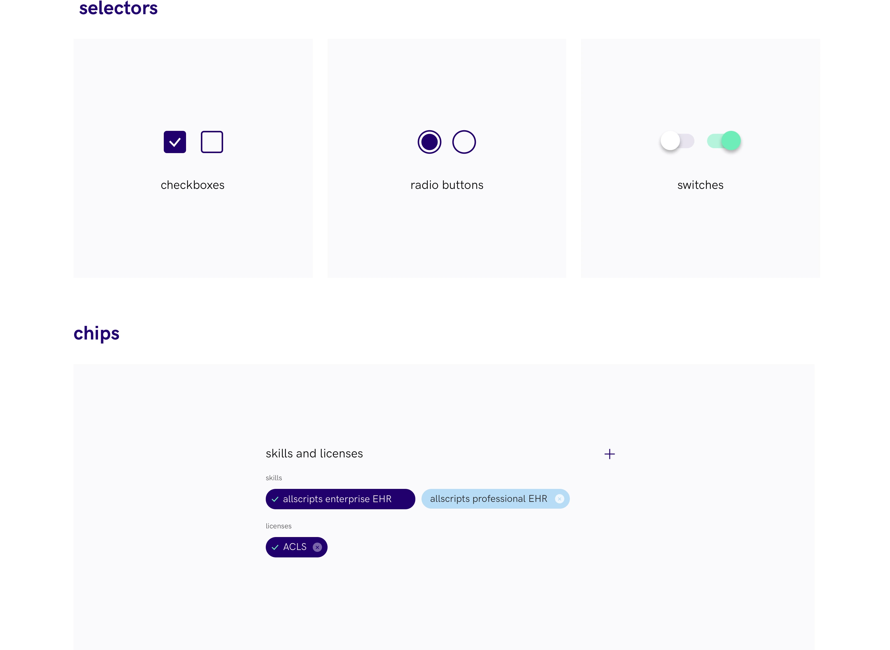
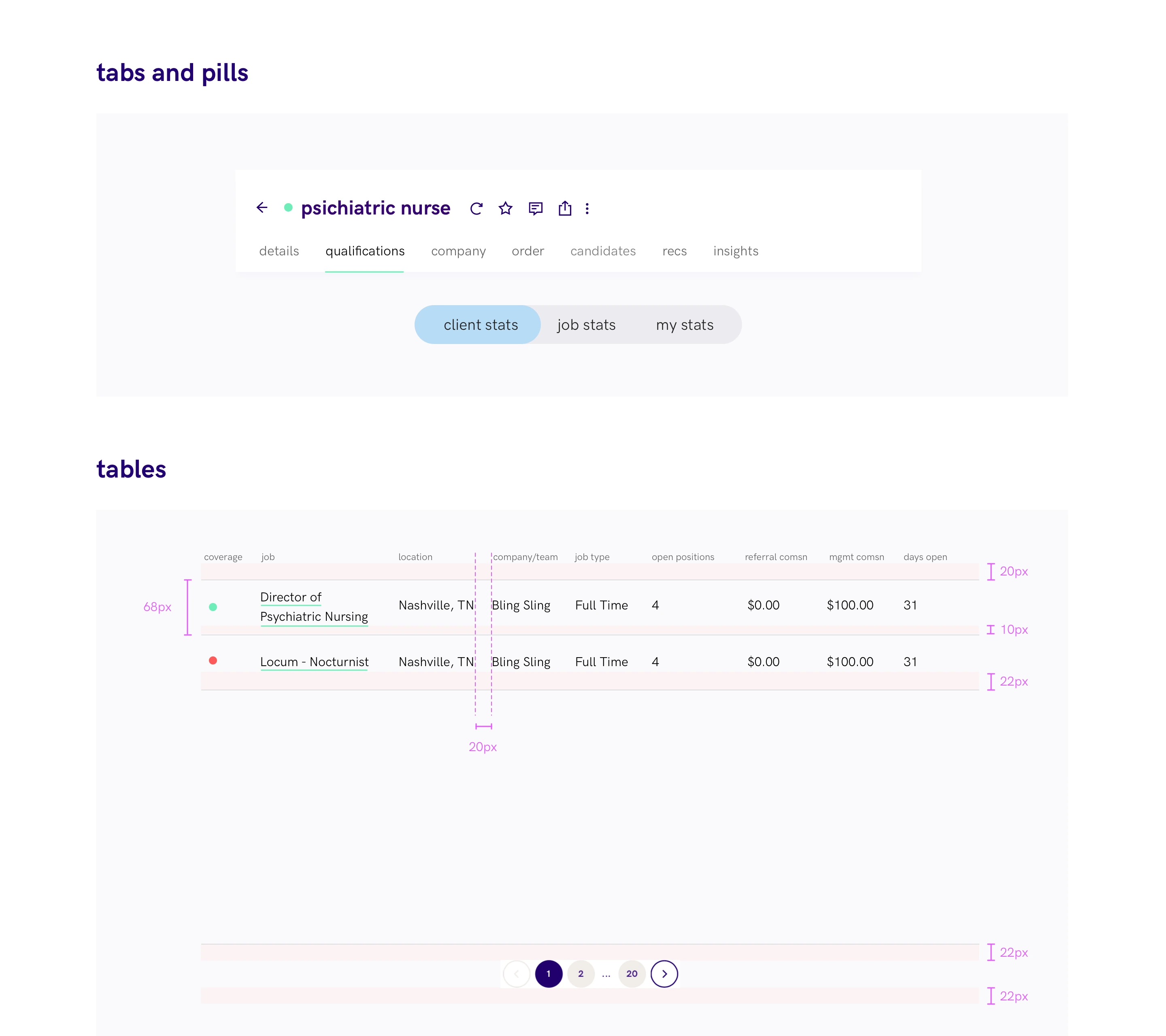
Selectors, qualification chips, tabs and tables became reusable patterns. We documented their spacing, states and behavior so teams could assemble new screens from a shared set of parts.
From components to complete screens
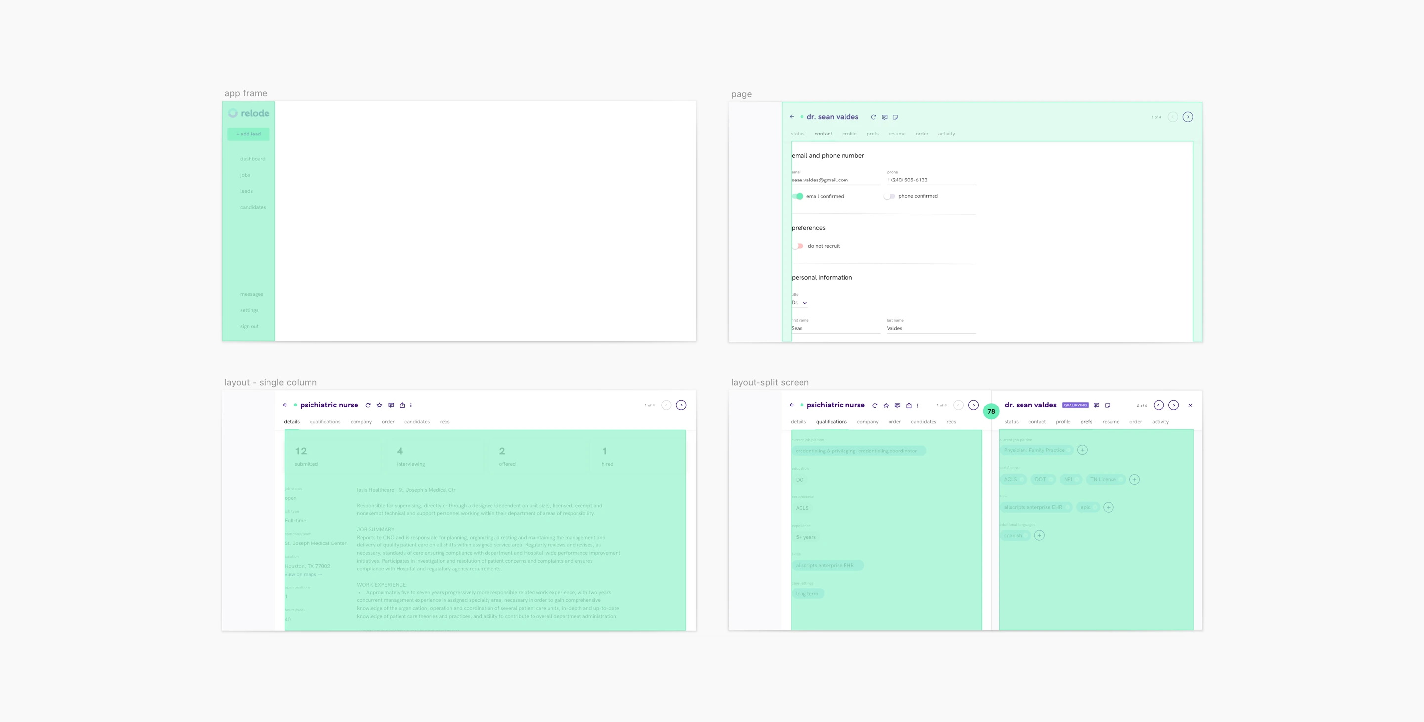
The system also defined page structure: where navigation sits, how columns divide the workspace and how related information stays together. These layout patterns connected the individual components to the candidate, referral and employer journeys they serve.